We may earn money or products from the companies mentioned in this post.
Is the endless search for the perfect gray giving you gray hair?
Finding the perfect gray to suit your needs is so difficult. And no I’m not talking about Jamie Dornan. While he might be the perfect man, I’m talking about the color gray. There are just so many variations, tones, and undertones of gray. While living out a gray might seem easy and effortless. Let me tell you, it’s not!
And I have a feeling that since you’ve clicked on this article, you know exactly what I’m talking about. There are just so many shades of gray! While we all know that gray might as well be the most popular color, it would be great if there weren’t so many options, swatches, textures, and finishes. Yes, they provide a plethora of options, but they also confuse me to no end. Who would’ve thought that a basic color like gray would give me a run for my money?
Gray is the new Beige (Why is gray so popular?)
You can see gray in almost every interior designing decor, gray is the new beige. And sometimes it makes you wonder why is gray SO popular?
Gray is quite literally the ultimate last resort. While Blues and Greens might intrigue you the real question is… Are they going to pair well with the couch your Grandma gave you? Or the dresser you bought at the garage sale? What about the ornate cupboard that has been in your family for generations? Gray is the jack of all when it comes to interior decor mood boards. You can incorporate gray in vintage eclectic, bohemian, modern minimalist, or even in your child’s nursery. It also acts as great complimentary color and sits well with almost the whole color spectrum. It adds character to your room without completely overpowering it and looking dull or monotonous. You really can’t go wrong with gray.
How to choose the perfect shade of Gray
There is a reason why gray has been the ‘it’ color for a long time now. It is unbelievably versatile and goes with anything saving you a lot of time when it comes to decor. However there a few things you need to take into consideration before choosing the perfect gray for your space. If you are not getting a professional paint consultation and are a 1 wo(man) army when it comes to revamping your house… Keep on reading! Gray easily adds depth to a room and can either be the ideal blank canvas or make a bold statement. But it is highly imperative that you get the temperature of your gray right.
Lighting is something you have to factor in when you’re deciding between a cool-toned gray and a warm-toned gray. If you are facing North, then your windows will cast much more of a bluish cool hue in your house while the South will cast a warmer hue. If your windows are positioned east/west then the lighting is going to change during the day. East will be warmer during sunrise and the west will be warmer during sunset.
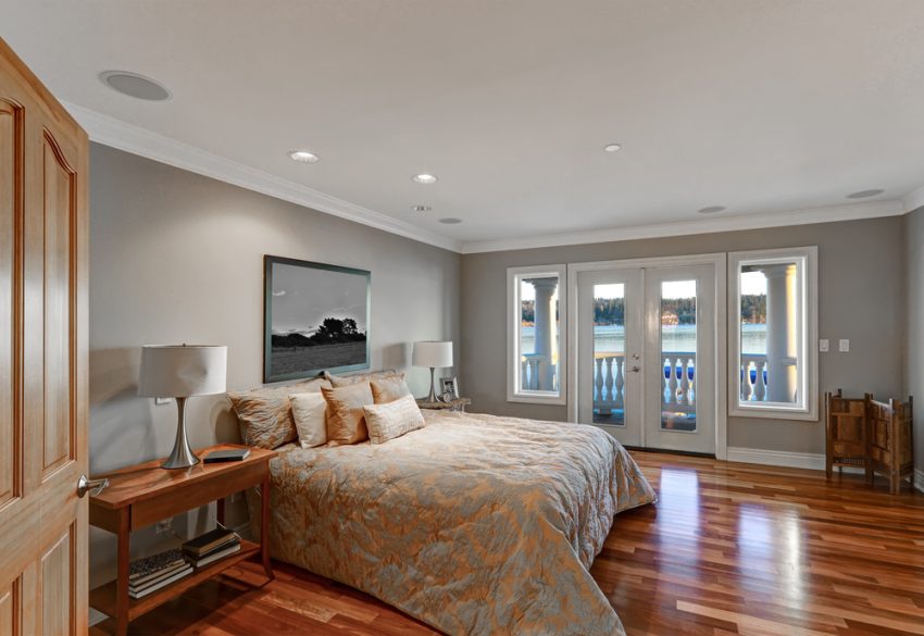
You’ll have to face a bit of a challenge if your rooms face North or West. The lighting in these rooms can easily make your gray look flat and icy and wed not want that. Hence our best bet would be to lay down a darker gray that has undertones of yellow or brown. Or you can go for a neutral grey that doesn’t have any strong undertones. Read the curated list below to find out which gray has a stunning brown undertone.
On the other hand, if your room is bathed in Souther or Eastern lighting you can sit back and relax. These rooms look glamorous and timeless with both cool toned and warm toned gray and hence you won’t have to rack your brains too much when it comes to deciding on a color.
Also, I can’t stress this enough when I say, please test and swatch your gray. The tones of the gray you see on the paint website, and in real life are going to differ. And on top of that, you need the gray to soak in your wall and then see how it works with different lighting in your house during the day. Put in this extra effort of swatching before you paint your whole wall or else you’ll be stuck with a gray that doesn’t match your house and lighting at all.
Choosing between Warm and Cool Grays
We’ve established by now that gray is highly versatile. But in order for you to have the ideal gray for your house, you need to differentiate between cool-toned grays and warm-toned grays. Warm tones are quite underrated but they have neutral tones that make your room feel cozy and mysterious. Warm-toned grays go better with wood tones and thrive when they are paired with a neutral monochromatic beige and off white color palette.
On the other hand, a much more cool-toned gray will pair better with crisp white, grays, or blacks. The cool-toned grays work better with a modern decor style. They thrive in minimalist decor and when incorporated with metals, they look absolutely stunning. They have a tendency to look flat and dull quite easily so make sure your decor is lively enough to accentuate it. The darker grays are more used for an accent wall. Unless your a bold and wild spirit who wants to paint all the walls a darker gray which in my opinion looks beautiful. But if you have 100 accent wall questions, don’t worry we got you. We weren’t lying when we said this is a one-stop destination to chase away all your gray worries.
1. Light gray

We’re starting off nice and slow with a light cool-toned gray. This one is quite the no-brainer. It is highly versatile and you can either keep a clean color palette with some whites or beige. Or you could go the complete opposite way and pair it with some bold blues and purples. This gray is not as cool-toned as other grays so it pairs well with warm tones as well. You can really play with textures when it comes to this gray. Paint this gray all over the walls and it reads in a way that is really neutral and mellow. Paired with some clean white trim, it will really enhance your hardwood floors.
This particular gray is: Agreeable Gray SW 7029, Sherwin-Williams
2. New Hope Gray

What is really cool and interesting about this particular gray is that it changes as the light hits it. It gives a completely different vibe as the lighting changes from the morning, to midday to dusk. It gives you a surprise each time you enter the room. If you love blue but find it a difficult color to commit to, you can choose this gray instead. It has a lovely blue undertone but the gray in it still helps the color remain fairly neutral. The color reminds you of the ocean and a room near Southampton beach, waking up to the sun shining on your face and a clear blue sky. Honestly, it does not get better than this.
This particular gray is: NEW HOPE GRAY 2130-50, BENJAMIN MOORE
3. Gray Screen

Gray Screen is actually one of the most popular colors sold by Sherwin Williams. And for good reason too. This cool-toned gray with a blue undertone looks almost exquisite. It is a really cool-toned gray that goes well with black, white, and beige. But if you want to bring in some contrast, you can add pops of warm-toned colors such as orange and red. The picture below has an all-gray color scheme and that’s one good thing about this gray. You can really manipulate and tweak it to suit your personal mood board.
This particular gray is: Gray Screen by Sherwin Williams.
4. Revere Pewter

We finally have a warm-toned gray! Warm-toned grays are very underrated and personally, I feel as if they deserve all the recognition they could possibly get. A warm-toned gray is ideal for an open floor plan and if you are going for a very warm and inviting feel. They look especially great at night when they are highlighted by some warm lighting. It pairs well with hardwood floors and is perfect if you have a lot of windows where natural light streams in, as it further accentuates the color.
This particular gray is:- Revere Pewter, Benjamin Moore.
5. City Shadow

This gray is more on the darker side. It has green undertones that give it a much more smoky and mysterious feel. It is bold and definitely makes a statement in any room. Regardless of that, it also blends well with all your decor and you can make it more neutral by having more beige or white furniture pieces. But you can also further enhance how bold this color is with pops of blue or red. This color of gray is quite versatile and works well in a dining room, living room, bedroom, or even on your cabinets in your kitchen in order to give a modern look.
This particular gray is:- City Shadow by Benjamin Moore
6. Rodeo

Rodeo is a true hybrid. It has equal amounts of cool and warm-toned gray which makes it the perfect neutral gray. You can’t possibly find a gray which is more versatile than this. You can use it anywhere and pair it with anything. It compliments all colors and decor becomes a piece of cake when it comes to this gray. It is on the lighter side and hence it really opens the room and makes it feel light and airy. I can go on and on about how versatile this color is! It really gives your space a timeless and elegant feel.
This particular gray is:- Rodeo by Benjamin Moore
7. Gray Owl

Gray Owl is another gray which is not too cool but not too warm. It is neither light nor too dark. It is smack in the middle. This color also pairs well with almost anything and everything. You can keep a neutral monochromatic color palette by pairing this with creams and whites or you can also go with a darker color palette by pairing it with black, royal blue, or emerald green. Needless to say, this color will look stunning in any lighting and decor.
This particular gray is:- Gray Owl, Benjamin Moore
8. FieldStone

This is a medium gray with a green undertone. But it isn’t that green and is balanced out with a little yellow so that the color isn’t that sage. This is one of those colors which tend to shift a little when there is differentiation in lighting. Sometimes it looks a little more green and the other times it looks seemingly neutral. This color isn’t that dark which makes it a little less bold and overpowering. And hence you can easily paint this in your dining room or living room and pair it with some wood tones.
This particular gray is:- Fieldstone, Benjamin Moore.
9. Stormy Sky

The name suggests exactly how the color is. It accurately represents a stormy night. This hue is quite elusive and looks very mysterious and moody. It is bold and definitely makes a statement. It can be very dramatic but at the same time also blend in seamlessly with your decor. This gray has undertones of midnight blue and looks quite stunning as an accent wall or throughout the room. You can break the dark monotony by bringing in some white furniture that acts as a perfect contrast. But if you want to make the setting more warm and cozy you can pair it with some wood tones and beige.
This particular gray is:- Stormy Sky, Benjamin Moore
10. Repose Gray
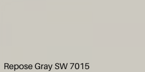
This gray is tried and tested over the years and it truly is the perfect blank canvas for your house. It goes well with all different types of textures and prints and if you’re looking for a versatile blank canvas that is compatible with everything this is the color for you. A lot of people have painted their house using this color and then modified or accentuated it with pops of color that suit their mood board. It really is the ideal blank canvas for your brand new home.
This particular gray is:- Repose Gray, Sherwin Williams
11. Greige
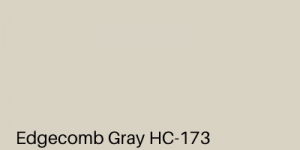
This list is incomplete without a true greige. This gray mixed with beige marries well with almost anything and everything. It is neither too gray, nor too beige. It is smack dab in the middle and suits your neutral monochromatic color palette beautifully. In cool-toned lighting, it will look grayer, but paired with warm neutrals and lighting it appears to be more beige. Hence you can easily manipulate your decor to suit your mood board. It honestly depends on what you pair it with.
This particular gray is: Edgecomb Gray by Benjamin Moore
12. White Metal

White Metal is one of those grays that in bright lighting almost looks white. It is a very light-toned gray and is one of Behr’s best selling hues. People love this gray as it provides a chic blank canvas for their brand new homes. It has an instant appeal and has the ability to give your crust dusty home a complete 360 and make it look much more sophisticated and rich. It opens up the space and makes it feel light and airy as if you’re in an Airbnb in Palm Springs.
This particular gray is:- White Metal N520-1 by Behr
13. Coventry Gray

This gray was part of the historic collection of Benjamin Moore. Hence there is a reason why it is still very popular even today. This cool-toned gray with amazing blue undertones will really give your house a timeless feel. You can use this color anywhere. To paint the outside of your house, your front door, and any room in your house from the kitchen to your newborn’s nursery. It pairs well with bold colors like pink and purple but you can also keep it monochromatic by going with a much more neutral color palette. You can also use a variety of cool-toned grays as complementary colors to really accentuate Coventry gray
This particular gray is:- Coventry Gray by Benjamin Moore.
14. Granite Dust

Granite dust resembles a hazy sky during monsoon or thick early fog. It has warm undertones and is a popular selling gray. This gray really gives the required depth to a room without completely overpowering it. It is warm-toned gray that looks like a dream when paired with wood tones and mauve. Paired with some solid black or white trim/moulding it will alleviate your place to a whole new level. Looks the best with some minimalist decor and mixed metals.
This particular gray is:- Granite Dust by Behr
15. Cheating Heart

This quite honestly might be one of my favorite hues of gray. Now while all of you might be thinking that a color as bold as this will make your room feel smaller and congested. But it’s actually the opposite. This color makes the walls almost disappear and alludes to a much more wide and open space. Cheating Heart has the perfect amount of brown in it to ensure it doesn’t become too cool-toned. Pair it with some faux leather and warm lighting and the room will instantly turn much more mesmerizing.
This particular gray is:- Cheating Heart by Benjamin Moore
16. Dark Steel gray

This is one of the darkest gray that we are going to cover in this line-up. Cyberspace is a dark steel gray that is definitely a sight to behold. At a first glance, you might get intimidated by this color but hear me out. Believe it or not, this color is actually pretty versatile. You can use this to have a statement accent wall in your house. Not to mention, this color goes with almost any other color. It is almost black, but a notch lighter and approachable. You can also paint your kitchen cabinets with this and have gold or silver handles for a modern look.
This particular gray is:- Cyberspace by Sherwin Williams
17. Steel Gray

This is a true steel gray and while this is on the darker side, you won’t regret incorporating this color in your house. If you don’t want this color to decrease the size of your room and make everything feel stuffy, you can open up the monotony by pairing it with some off white. It provides a nice contrast but it isn’t as sharp as white. Paired with some silver and other metals this gray will further be accentuated and look stunning. Reminds me of the craters on the moon.
This particular gray is:- Serious Gray by Sherwin Williams.
18. Wickham Gray

Often we worry that the gray we pick might look very dull and boring and downplay the beauty of your room. Well, you won’t have to worry about all those things with this particular gray. It feels like a breath of fresh air in a room. And I’ve always felt that gray looks that much better when coupled with white trim. It enhances the color and makes it look more cohesive with your neutral color palette. To break the monotony you can add pops of red and pink here and there.
This particular gray is:- Wickham Gray by Benjamin Moore
19. Silver half Dollar

Racking your brain over undertones but still can’t figure out the difference between cool and warm undertones? Why not take a neutral route instead? Silver Half Dollar is a true gray which does not have any undertones. And hence if you’re looking for a neutral color that isn’t white or beige, this is the perfect match for you. The best part is that it is amazingly versatile. It also looks stunning when paired with marble.
This particular gray is:- Silver Half Dollar by Benjamin Moore
20. Charcoal Gray
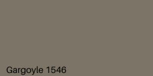
I always aim to make a bold statement in a subtle way. While that might sound highly ironic I know I’m not the only one who feels this. You want to make a statement but not so much that your eyes hurt as soon as you enter the room. And that is why this gray is perfect for that. It definitely makes a statement and has a lot of character without completely overpowering the room. The tone as suggested by the title is a medium charcoal gray with a nice brown undertone. You can’t really go wrong with a gray like this.
This particular gray is:- Gargoyle by Benjamin Moore
21. March Breeze

Ending on a highly calming and floaty mood, this particular gray gives you all the Greece vibes. It has such a warm undertone it almost reads as light mauve. Making it the perfect gender-neutral color for someone who wants something warm but also masculine at the same time. This color shifts with light and sometimes looks gray and the other times more warm-toned. It is quite a unique shade and really opens up the room. You can pair this with crisp white and bold pops of yellow and pink to really give the illusion that this room is straight out of a hotel in Greece.
This particular gray is:- Hampshire Taupe by Benjamin Moore
The best type of finish for Gray Walls
Now that you’ve decided on a color that best suits your living room, let’s talk about the finishes. I know this is pretty self-explanatory but I would just like to preface by saying, you need to have a smooth base to have a nice finish. Put the extra effort in. Sand down your wall, prime it. Make sure that you have a nice foundation before you lay your paint down.
If you choose a high gloss or semi-gloss finish, it can sometimes make your beautiful grays look like an industrial factory metal. Hence if you have a gray that is a little dark in color or has warm undertones a semi-matt finish might be your best bet. Then again, it all depends on the lighting you have in your room. When we talk about the cooler-toned and comparatively dull grays, they look better with a glossy satin-like finish. And it also helps cover up small flaws or smudges that might have happened during the process.
How to choose a darker gray accent wall
Accent walls have never been trendier. It gives your room a complete 180 and gives it a lot of depth and character. And hence usually people go for an accent wall that is darker in color. With that being said, you still have to make sure that your accent wall is cohesive with all your other walls and decor. And since we’ve noticed that a lot of people use a dark gray as an accent wall, we thought we’d make your job easier for you.
You need to make a purposeful contract between your accent wall and the color of the other walls. Hence your accent color needs to be at least 3-4 shades darker than your color. An easy way to do this is to take a paint color strip and choose a color that is 4 shades deeper on that strip. Sometimes you can even go 5 shades deeper. But don’t take a color that is right next to your base color. It will look like you’ve made a mistake.
There needs to be enough contrast in your grays to be able to call it an accent wall. Generally, you need to pair your warm-toned grays with a darker warm-toned gray and not a cool toned one. If you mix the tones of your gray, they won’t necessarily go together and it’ll make your accent wall look put of place. So male sure you get the undertone right!
Colour schemes that go with Gray.
Technically speaking, gray is a very versatile color and is pretty forgiving when it comes to decor. But that doesn’t mean you take for granted anything and everything with it. With a more warm-toned gray, you can pair it with some royal blue or greens and some warm woods. Or you can keep the color palette more monotonous by pairing it with some beige or off white. With the more cool-toned grays you can add pops of color such as red, pink, or purple. You can also further deepen the color palette by adding some blacks and dark charcoal gray in the mix.
And that is all that we have for you today. This is truly the perfect cheat sheet for you if you want to paint your rooms gray. The list is curated and covers all styles and mediums of decor and therefore there is something for everyone. It contains all the research you could plausibly need so that you don’t get gray hair while selecting a gray for your new house.