We may earn money or products from the companies mentioned in this post.
You are gravely mistaken if you think neutral colors are only for those who are boring. Neutral colors have been on an all-time high. Nowadays colors like blue and green have joined the ranks of neutral colors. Hence what was once a snooze fest has now turned into something elegant and timeless.
It can be difficult to choose a color that goes with the theme of your house, matches with all your decor, and looks beautiful and timeless at the same time. So, (drumroll please)… I bring you 21 colors that fit the description above perfectly at your fingertips!! Now, instead of sitting with paint swatches from a number of companies, why don’t you just go through this curated list of 21 best neutral paints from the best paint companies?
How to choose the best neutral paint colors?
Trust me nothing is more frustrating than painting a color all over the walls and realizing it doesn’t look good in your room. It’s either too dull, or too bright, the undertones are not what you expected, or your lighting is making the color seem very washed out. Been there and experienced all of this. But I’m not here to sympathize with you. I’m here to solve all these problems so you never have to go through the painful process of repainting your walls again and again and again.
While choosing a neutral color that might be the best for your space, you have to keep in mind the undertones. It’s the first step in choosing your final color. Every color either has a cool undertone or a warm undertone. And that mostly determines the vibe of the space. Cool tones are usually used for open and airy spaces that give calming oceanic vibes. Or for minimalist modern homes. Warm tones on the other hand are usually used for cozy and intimate spaces. Often seen in living rooms or restaurants, warm colors are very welcoming and soothing.
So I’m hoping you’re able to choose an undertone by now. The next step is to ALWAYS swatch the paint color on your walls. I can’t emphasize this point enough. You will only get to know how the color looks when you swatch it on your walls. The true undertones will show and you’ll get a sense of how the color will react to the lighting in your room.
You have to remember that your room is a cube and not a soiree. And hence make sure that the color you choose goes well with your floorboards and ceiling. Ceilings are not that difficult as a majority of them are white. But make sure your undertones marry well with your floor.
Now we’re finally ready to take a look at some of the best neutral paints out there.
1. Light Pewter

This Benjamin Moore is at the beginning of our list for a reason. It looks exceedingly beautiful and light on the walls. It’s one of those colors that work well with both natural and artificial light. Often used in the interior designing world, this color is the secret weapon of many designers to a quintessential neutral space. It beautifully opens up the room and makes it feel refreshingly light and airy. While this color is very usable and neutral, that doesn’t mean it shies away from adding some character to your room.
2. Breakfast Room Green
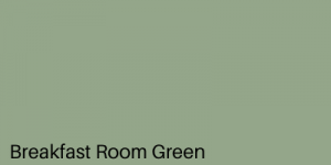
This color from Farrow & Ball is an absolute stunner. I was definitely not lying when I mentioned above that greens can now be considered a part of the neutral family. This green when painted all over the walls creates a beautiful contrast. You can use this color to paint your cabinets, your walls, a dim-lit nook. It truly is very versatile. It has undertones of gray in it and works well with both natural light and artificial light. In some lighting, this color almost looks gray.
3. Gray 2121-10

While this gray is a little on the darker side, it definitely gives room a lot of character. While some might not consider this shade as neutral, it honestly is one of the most versatile shades ever. It goes well with everything and the decor will definitely become a piece of cake. You can use this color everywhere and it just creates the most stunning contrast. One of my favorite ways to show a striking contrast is to use this color as a base for my walls and then paint my trim a nice shade of white. It looks effortlessly timeless.
4. Doeskin SW6044

Who says you can’t have a mauve taupe color in a neutral shades list. This color honestly makes your room feel so cozy and intimate, it just feels like a cocoon. Wood tones go perfectly with this color and just merge really well with space. Contrary to popular opinion, warm colors don’t make your room look extra small. It just makes it look more comforting and welcoming. You can balance the room by adding some white or grays. But you could really just go ahead with a warm color palette and make it a monochromatic room.
5. Pale Powder

This one by Farrow And Ball has to be one of my most loved colors and that is because this room makes me feel like I’m having a Pina Colada in the Maldives. It’s so light and airy and one of the most popular light blue shades ever. This color is light enough to be on your ceiling, but its green-gray undertone gives it some underrated depth. Sometimes this color almost looks gray in a north-facing room or a dim-lit room. You don’t have to worry about it being too cool as it has a green undertone. And hence you can decorate easily, by using a warm or cool-toned color palette.
6. Hush

We finally have a beige, and no it’s not boring. I’m sure you’ve heard so many times that beige is boring. I’m here to tell you the exact opposite. There is nothing more satisfying than having a nice warm beige on your walls. And this color is truly so forgiving when it comes to decor styles. You could go through the bohemian route, vintage eclectic, 90’s retro, country. It honestly is so versatile, you’ll definitely not regret having this color in your house. It instantly makes your room look timeless, elegant, and welcoming.
7. Stony Ground 211

This is a classic stone color that you might see all over Venice. I mean you couldn’t possibly go wrong with a classic stone color. When I say you can use this color everywhere, I mean it. It has a relatively light warm undertone that does not completely overpower your room. A beautiful beige finish is guaranteed and it works beautifully with both natural light and artificial light. It truly is the perfect base color and supports all accent color walls well. You can also use this to create a bit of a contrast with an ivory white or some charcoal black.
8. Barista
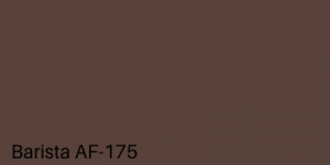
I know what you’re probably thinking. A dark brown in a neutrals list? But just hear me out. This warm-toned brown is the ideal color for someone who’s looking for a deep-toned neutral. It instantly creates a warm mysterious vibe. While this color may look intimidating at first, once you see it on your walls, you’re going to absolutely love it. You can balance the dark by bringing in some light furniture pieces or you can go with a dark color palette. Either way, your roo will look rich and sophisticated.
9. Blackened No.2011

Ironically this is an ivory white color. This is a wonderful white with a gray undertone. It remains light enough to look white, and in a dim-lit room, it looks the slightest bit gray. This color continues to remain very popular as it isn’t stark white. Hence it gives a lot of depth to a room and doesn’t make it feel washed out. Acting as the perfect transition color between your bold hues, this color is far from boring and overrated.
10. Montpelier

We have a dark color yet again, and this one is a stunning charcoal gray-blue hue from Benjamin Moore. This color is truly unique as it looks moody without being too overwhelming. Irrespective of being a dark color, it has a very calming and soothing feeling to it. Even though it has a cool undertone, you can easily pair it with some natural wood tones and beige to bring in some of the warmth. A quintessential living room or master room color in my opinion.
11. Sterling

If you think some classic white will be too plain for you, Sterling is a stellar gray from Benjamin Moore that will be the answer to all your questions. This light cool-toned gray manages to be soft while still having a blue undertone. It is so light that in bright daylight, it may even look white. Sterling is one of those colors that changes hues as the lighting changes. This color is not that cool-toned and so you can easily incorporate some warmth in your decor. Either way, this color is the perfect cool-toned light gray.
12. Wind’s Breath

If you haven’t heard about the color greige, you’ve been living under a rock. A greige is the perfect combination of gray and beige which makes the color neither too cool nor too warm. A lot of people use this color all over their house because there is hardly any color that is more versatile than a greige. It looks timeless and elegant. Also, you won’t have to worry about decor because greige literally goes with anything and everything. This particular greige is often used by a lot of homeowners all over their house as it is an amazing base color and supports a lot of accent wall colors.
13. Cornforth

This color adds the perfect amount of drama and character to the room without being too hard on the eyes. It is a neutral color with gray undertones that alleviates the e4ye to the walls but does not completely overpower the room. It’s the perfect substitute for a white. Not only does it look good in both artificial light and natural light, but it also adds the perfect bit of contrast when set against some white trim. This subtle touch of color on your walls can add a lot of sophistication and elegance to your walls.
14. White Dove

While you might think that white is a little too basic for your walls, White Dove by Benjamin Moore is a complete game-changer. It is lightly shaded and has very light undertones so that your room doesn’t look completely washed out. This white is a go-to for most interior designers. And for good reason too! It works well in both traditional and modern homes. You can use this for a minimalist approach, but that doesn’t mean it disappoints when it comes to country homes.
15. Elephant’s Breath

This earthy toned gray is one of my favorites from the list. I just love it so much. This Farrow & Ball stunner is a medium toned gray that looks almost lilac in some lightings. It has the slightest tinge of magenta in it and looks divine on the walls. It isn’t very dark and bold, and hence if you’re going for something light and airy that can still make a statement, this color is the one for you. This color changes as the lighting changes and hence it never fails to make the room lively. Elephant’s Breath is airy while still having a relatively dark undertone.
16. Feather Down

A neutral is so much more than just a neutral. It remains relatively light but still adds so much character to a room. This warm-toned neutral adds a soft hue all over the room. It’s a go-to color for most people as it casts a warm cozy vibe all over the room. This color thrives in natural lighting but also works well with artificial lighting. It’s such a classic color that you honestly can’t go wrong with it.
17. Cloud Cover

This color is neither too white nor too beige. It is the perfect light-toned off white that is drop-dead gorgeous. It’s quite often seen in living rooms and sometimes all over the house as it is just cool enough without looking too sterile as it has a hint of warmth in it as well. A classic Benjamin Moore stunner, it is the quintessential base color that you didn’t know you needed. If you’re looking for a white that is not too cool-toned and washed out, this is the color for you.
18. Amazing Gray SW7044

We have another gray that is neither too cool nor too warm. But this one has a little bit of a deeper tone. It’s not the classic neutral tone you see. And that is exactly what makes it so sweet. This color has the ability to be incredibly versatile. You can paint it on your walls, on your kitchen cabinets in your bedroom, etc. It adds the perfect amount of contrast against some natural wood tones and looks quite stunning. An added bonus is the fact that decor becomes a walk in the park as you can basically go with any style you want.
19. Chantilly Lace

It can’t be a neutral colors list without a stunning crisp white incorporated in it. This stunner from Benjamin Moore will be the answer to all your white questions. There is hardly a color that is better suited as a base color than this one. It acts as a blank canvas to your whole house. It has a cool hue to it that makes the whole house feel very light and airy. Accent colors look great with this wall, and art pieces have a nice contrasting background. But it is a stunner as a naked wall as well.
20. Accessible Beige SW7036
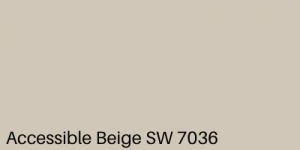
Quite possibly one of the most popular of Sherwin Williams, Accessible Beige is the Beige of your dreams. Its light warm hue casts a golden gray shadow all over the room. It works well with both natural light and artificial light. And it is so versatile that you can use it from modern homes to country homes and everything in between. You will hardly have any complaints with this color. It sets off beautifully against wood tones and you can either have a warm color palette or create some stunning contrast by bringing in some elements of white and gray.
21. Urban Putty SW7532

As the name suggests, this color is ideal for the quintessential cosmopolitan feel. This is the color you see in those fancy interior design magazines. It is widely used and is the secret weapon of many interior designers. You can paint this color all over your house. From your bedroom to your kitchen, this color works well in any space. This medium-toned color changes with lighting and looks very unique and timeless on the walls. Works well with both natural and artificial light, this color will never fail to impress you.
FAQ
What are the neutral paint colors?
Neutral paints are those paints that can be commonly used in any space and can be manipulated to fit a variety of decor styles. While earlier white, beige, and gray were the only colors that were considered to be neutral, now blue, green, and brown have joined those ranks as well. Hence it is not necessary for the color to be light-toned as long as it remains to be versatile and easy on the eyes.
How do neutral colors make you feel?
There is a reason why neutral colors are so popular. And that is because they have an overall calm and soothing feel to them. They can make any room feel very light and airy. It opens up space and gives a very relaxed vibe. Also, you don’t have to worry about choosing a very specific style of decor as these colors usually work with various different aesthetics.
The overall feel of neutral colors is very effortlessly timeless and elegant.
What are the cool neutral colors?
Cool neutral colors are typically those colors that have a blue or gray undertone. They are on the cool side of the color spectrum. These colors are very soothing and calming to the mind and can make any space feel like an oceanside villa with how airy and light it looks. Cool-toned colors pair the best with natural light. Usually, these colors are used for modern, well-lit spaces.
What are warm neutral colors?
Warm neutral colors are those which have a yellow or red undertone in them. They are on the warm side of the color spectrum. These neutral colors have the ability to instantly make the room feel warm, cozy, and intimate. Being very versatile, these colors work well with both natural and artificial light. Typically used in more traditional and country homes, warm neutrals have been in the neutral game for a long time now.
Well, there you have it! A curated list of how to choose the best neutral color for your house. I’m pretty sure you don’t view neutral colors as boring and overrated now. There is so much more to neutral colors than what meets the eye. They add some subtle character to the room without being very dramatic and overpowering. Now, you don’t have to worry about being too basic by painting your house with a beautiful timeless neutral hue.