We may earn money or products from the companies mentioned in this post.
The most important factor that decides the mood of a space is the color filling up its walls, making up for 60 percent of the color in the room.
Selecting the best hues for your kitchen can be super easy yet a tricky task. The main problem arises because of the huge variety of coloring options available out there in the market. It holds the capacity to render even those with the firmest opinion confused. It makes you rethink and repicture your dream interior themes.
I went through the same struggle while selecting hues for my place. Moving in and out of multiple paint stores and trying on a gazillion colors gave me a set of simple rules that I strictly follow while renovating any part of my house.
How to choose the best kitchen paint colors? A few rules of thumb
1. Decide a mood according to your cooking style
Think about your cooking pattern. Is it more of a ‘stick to the pasta and bread’ type or is it more of a freestyle? For those who like inventing and recreating, bright shades are the most appealing. On the contrary, if you’re more on the basic side, then neutral shades call you with utmost serenity.
2. Think of a color palette
After you have decided the feels of your kitchen, think of a color that will work for the same. For example, if you opt for bright shades, then lighter shades of yellow can work for you. Or if you want a simple and calming look, go for shades of blue.
3. Choose all the shades you like and compare them
Now that you have an idea of what you want, let’s proceed towards the main functional step of stepping into the paint store. Select multiple shades of colors of your choice. Also, look for additional color options in the display aisle. Keep them side by side and compare them to toss out the options that don’t appeal anymore.
4. Bring them home and coordinate with the adjacent rooms
After listing out your favorites, it’s time to bring them home and see if they match the interiors of your house. Also, at this point, you need to think about the fact that the color you choose is in synchronization with the rest of your home. For example, you have a pale blue living room and then suddenly entering a bright red kitchen can seem a bit off. Make sure that the palettes and finish you choose go well along with the theme of the rest of your home.
5. Bring in a sample and test on the wall in different lightings
Now that you have found some shades that are equally good and go well with the rest of your place, it’s time to make the final selection. Walk into the store once again and pick up samples of the shades you have shortlisted. Now paint a corner of your kitchen with these samples and let dry. After they have dried up, inspect them for their overall look in different lightings. Go for the shade that appeals in its own special ways to you.
This step is most important as most colors look different on the sample tiles than on the walls.
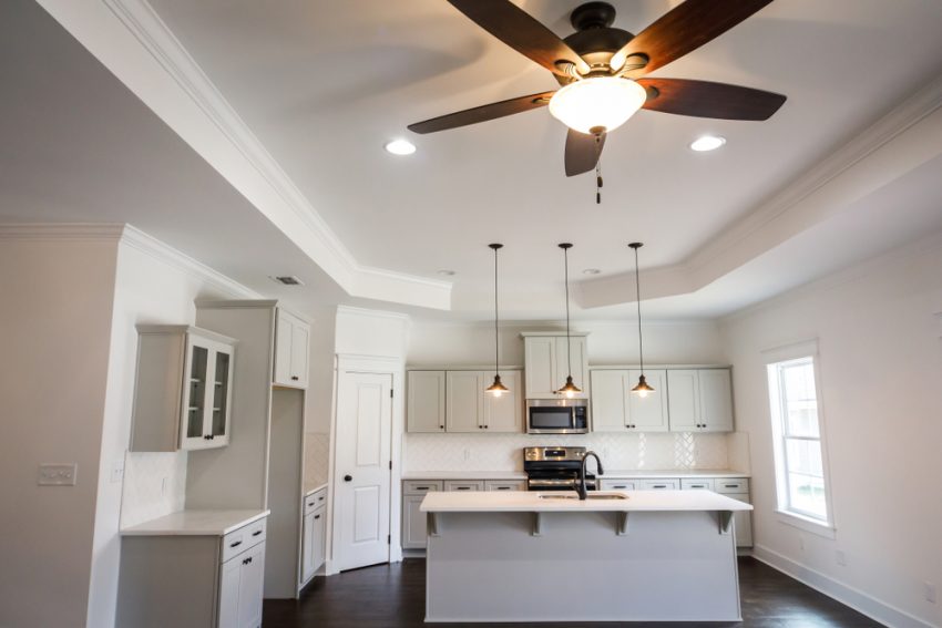
Now that you know how to look for the best fits for your kitchen, let’s look for some inspiration for your walls. Here are some of the best hues to give your walls a new life!
41 Best Kitchen Paint Colors
1. La Luna Amarilla (SW 9016)

Let’s start with a warm and welcoming shade from Sherwin Williams. This color gets along with everyone easily, be it a beginner or an expert cook who likes to experiment with his ingredients and skills.
This cheerful shade fills the space with enthusiasm that inspires us to experiment, create, and be playful at the same time. So, if you’re the one to try your hands on everything on the diverse cookbook, then this shade might be the one for you!
2. Gauntlet Gray (SW 7019)
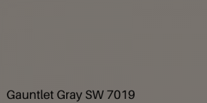
If you strive for a classy shade, also, neither too loud nor too plain, then this shade by Sherwin Williams seems to match all your expectations.
This subtle shade goes extremely well with a date night or your work-from-homes with its perfect matte finish. Altogether, this color goes best for an enthusiast always on the go, keeping this classy and professional at the same time.
3. Lacewing (SW 6729)
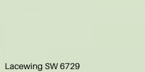
This shade inspired by mother earth from Sherwin Williams is the best match for gardeners and nature enthusiasts. Its fresh hues instill you with liveliness and motivate you to get started for your day ahead the moment you step in for your morning coffee.
Also, this shade goes well with your family dinners, making everyone lose all their stress and detox consuming happiness by spending some sweet moments with everyone.
4. Orchid (SW 0071)
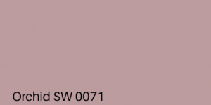
Pinks have a special quality. They go with everything and everywhere, isn’t it? Also, they carry a certain sense of smoothness with them that appeals to us in its special ways. So does this shade from Sherwin Williams.
The soft and subtle appeal of this shade fills you with immense serenity and keeps you prepared for all kinds of situations and occasions.
5. Neighborly Peach (SW 6632)
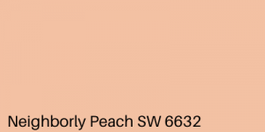
Presenting to you another shade from the happy colors family. This peachy shade from Sherwin Williams is one of the best choices you can make if you want to be a little funky but not too loud.
With its bright and lively finish, this color fills us with a different kind of energy and uplifts the dullest of moods. Altogether, your grumpy partner won’t be grumpy anymore after having their morning Americanos in here.
6. Soft Fawn (SW 9097)
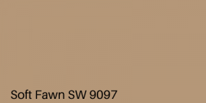
This Sherwin Williams shade shouts out to the ones who love bold and loud. This blaring shade fills up space with a lot of elegance and sensual beauty at the same time. For peeps fearless enough to try something out of the convention and celebrate its sense of freedom, this can be the one they’re looking for!
7. Reflection (SW 7661)
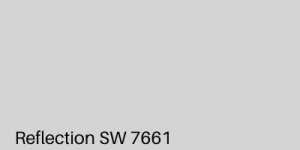
This shade from Sherwin Williams is as fresh and pure as the water dripping out from a melting glacier. Plus, the light tint of blue in it allows you to turn into whatever shade you want with the right lightings when the sunsets. This delicate blue tint comes out strong when the kitchen is your space to relax and unwind yourself.
8. Fun Yellow (SW 6908)
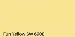
As fun as it sounds, this shade grom Sherwin Williams is a full-on package. It is bright, warm, welcoming, and fills up space with a sense of joyfulness. After all, that’s what yellows are supposed to do, isn’t it? For all the cooks who enjoy inventing new cuisines every day, this can be the one as the results it gives are amazing!
9. Celery (SW 6421)

Another natural hue from Sherwin Williams giving a close to nature feel to our kitchens. After all, kitchens are the place closest to mother earth after our gardens(if we’re lucky to have one).
This shade, just as celery when topped on our food, adds extra flavor to our kitchens. Giving the kitchen interiors an elegant finish, this makes your interiors party-ready whether it be small friends reunion or a family get-together.
10. Comical Coral (SW 6876)
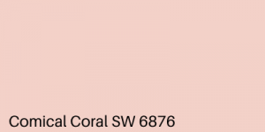
This pale reddish-pink shade from Sherwin Williams might actually seem comical to some anime or manga lovers because of its resemblance with some anime character’s skin color(or it might not, maybe it’s just me).
This playful shade is one of my favorites when it comes to adding a pinch of kiddish funk to space. Not only is this shade joyous but also soft in its tones making it apt for lifting both kids and adults up.
11. Undercool (SW 6957)

This cool blue shade grom Sherwin Williams is one of the best options for a chilled out environment inside your kitchen. The refreshing vibes of this shade are really helpful when your daily routine usually leaves you dead tired. The enthusiastic feels of this shade are apt for people with all kinds of cooking patterns and also for those who need frequent mood uplifts.
12. High Reflective White (SW 7757)

When it comes to an expensive, elegant, and classy looking interior, then what can be better than opting for whites.
This off-white hue from Sherwin Williams is the best color that can add a posh look to your home without having to do or spend much on the furnishing and modeling of your home. After all, minimalistic is the new millennial trend.
13. Grenadine (SW 6592)
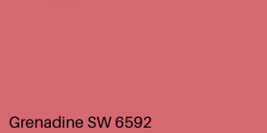
This bricky shade from Sherwin Williams is the shade that can make you drift from the general idea of applying neutrals on your walls and switch to bolds and brights. With a tinge of pink, this adds a lot of happy colorful vibes to your joyous place. I bet it can make you love cooking in case you’re not a fan.
14. Luau Green (SW 6712)
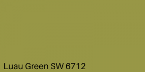
Express your love towards mother nature with this splendid shade from Sherwin Williams showering your interiors with lush and vibrant texture along with a graceful and eye-pleasing finish. Also, the way it transforms in night light is super classy which makes it best for family dinners and get-togethers. This breathtaking and sensual beauty is something that no one should be kept void of.
15. Napery(SW 6386)

This light shade from Sherwin Williams with slight brown undertones is best suited if you want a lot of freshness in your cooking area. With its bright appeal and calming tones at the same time, it soothes the eye of the viewer giving them a sense of calm and joyousness at the same time. It also contributes a fair share in providing a fresh feel to the surroundings.
16. Smoky Blue(SW 7604)
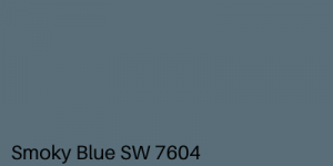
This shade of blue from Sherwin Williams with gray undertones in abundance is one of the best shades to smoke up your kitchen interiors with utmost sophistication and swish. The tones that it carries makes your kitchen extremely alive when you organize friends or family meet. It has a unique quality to outshine in all kinds of lightings and environments.
17. Sierra Redwood(SW 7598)
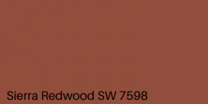
Sierra Burgess might be a loser but on the contrary, Sherwin Williams has made sure that Sierra Redwood isn’t. This lovely brown with hints of red makes it the perfect shade that is both bold and beautiful. When comes to looks red never disappoints us, isn’t it? Similarly, this tinted brown can add a superior look to your interiors.
18. Lupine(SW 6810)

Need something bold and ritzy? This blue from Sherwin Williams is a not so popular yet attractive shade you need to try. Not yet discovered by many when looking for paints to paint their kitchen, this can be a new option to add vibrant colors to your space. The saturation and elegance of this shade make it an awesome choice for your kitchen.
19. Pebble Stone(2100-50)
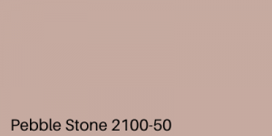
This shade by Benjamin Moore is a perfect blend of softness and saturation. The light brown color of this shade mixed with some pinkish blush giving it a soft mud-like texture shows how diverse this is in terms of colors and moods. This shade is as deep on the walls as Benjamin Moore has thought while fabricating this blend.
20. Artistic Taupe(SW 6030)
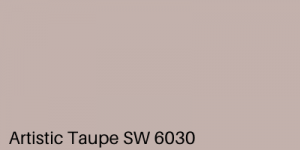
This shade from Sherwin Williams has won me with its subtle nature. This is a beautiful combination of pinks and browns to make an exceptionally different shade just like a chemical reaction, which makes you forget both the initial inputs. If you want a soft and sweet essence on your walls, then this shade can be the one for you.
21. Cat’s Meow(1332)
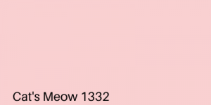
This subtle shade from Benjamin Moore caresses your walls the same way you caress your cat. Pink is the loveliest of colors and adds a lot of lovely vibes to the kitchen when applies to the walls. Caress your mood and food with this delicate hue to add delicious flavors to your life. You’ll be astounded by the results.
22. Convivial Yellow(SW 6393)

This color from Sherwin Williams might look a bit pale and dull on the paint tiles but is extremely bright and lively when put on the walls. It is for colors like these that the final rule of thumb is very important. With the freshness of the sun, it has the calm of a tree shade, making it the perfect combo to extract the most out of your kitchen.
23. Van Dyke Brown(SW 7041)
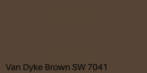
This shade from Sherwin Williams can be titled as the boldest brown anyone can ever choose to apply on their kitchen walls. The rich, creamy, matte, and plush feels with which this color is overloaded can be a little too much for those with a weak heart to handle. One has to be very bold and confident to flaunt this extravagant shade in their interiors. But once you dare take this risk, I bet you’ll never regret it after.
24. Sabre Gray (1482)
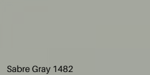
This shade from Benjamin Moore’s Classic Color collection is one of the finest grays you can opt to put on your walls. Neither too pale nor too dark, this is just the perfect gray you would like to ornament your walls with. Everyone is known for the exceptional calming quality of this neutral color. This shade makes sure to enhance it to the fullest.
25. Camel Back(1103)
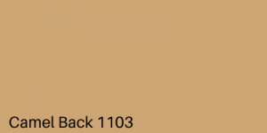
Glistening like camel hair, this shade from Benjamin Moore makes sure that the colors fabricated in nature are celebrated to the maximum extent. Just like a camel blazing in the sunlight of the deserts, your kitchen will shimmer with the luster and creaminess of this shade. This shade adds a sense of warmth and saturation to the interiors.
26. Emerald Vapor(845)
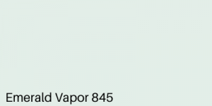
Precious as an Emerald, this tint from Benjamin Moore’s Classic Color collection makes you feel lost in the greenery reflected by the ponds covered with lush greens. Nature or nature-inspired colors, but never deviate by even an inch from instilling peace in the environment. Similarly, this shade never disappoints you when looking for a place to relax.
27. Lily White(2128-70)

For those who don’t want to add a lot of colors to their space and keep things as simple as possible, this blue-tinted shade from Benjamin Moore is the one to meet all their expectations. When you want something white but not pure white, then this shade works best to provide the desired look. The blue tint adds a pinch of freshness to the elegance added by the white undertones in your kitchen.
28. Pink Bliss(2093-70)
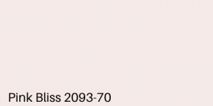
‘This neutral hue from Benjamin Moore fills the interiors of your kitchen with happiness and tranquility reminding you of fresh flowers and wedding finery. With its pink tint this color is as soft as a bride’s veil’, say the color experts at Benjamin Moore. The delicate color and softness of this shade are perfect for maintaining a happy and satisfying aura around the room.
29.Wool Skein (SW 6148)
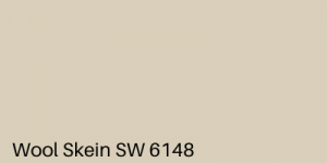
This hue from Sherwin Williams with pale yellow and strong gray undertones gives an open and welcoming outlook to your kitchen interiors. The subtle and full of brightness vibes of this shade are the most appealing factors of this hue making it equally suitable as any other neutral hue for being put up on your kitchen walls.
30. Basil(SW 6194)
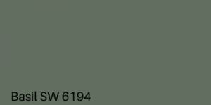
Another nature-inspired shade topping the list with its boldness and posh outlooks making you rethink your opinion of sticking to the neutrals is this olive green shade from Sherwin Williams. Being a fan of bold and loud, this is one of my favorite greens when selecting paints for kitchen interiors. Also, it has that internal shine and sparks to glaze your kitchen without investing too much in fancy furniture.
31. Amethyst Cream(2071-50)

This soothing violet from Benjamin Moore comes with a pinch of gray blended effortlessly to give your walls a vibrant and smooth finish. Just as the name suggests, its creamy texture is the factor that pulls everyone towards its beauty and provides a cool yet warming atmosphere to your interiors.
Isn’t it interesting how the pinks and purples keep up to all your expectations?
32. Citrus Mist(141)
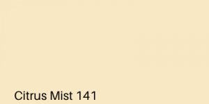
This bright and lemon fresh shade from Benjamin Moore is one of the best shades of yellow you can find if searching for light and lively shades. Not only it provides you with a lively feel but also a creamy lustrous finish that is very important to give your space the saturation it requires. Neither as bright as the sun nor as dull as honey, this rest somewhere in between, making it a viable option.
33. Purple Haze(1413)

This purple haze from Benjamin Moore with a lot of gray in it makes it one of the best neutral shades you can think of putting on your walls.
What makes a neutral shade the best version of it is the extent to which gray is added to it. Whenever looking for the perfect neutrals, go for the ones which have gray in abundance along with your desired hue.
This shade qualifies all the aforementioned traits and makes an excellent neutral in purple.
34. Desert Twilight(2137-40)
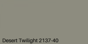
This shade from Benjamin Moore depicts the serene of a desert at dusk. This olive-like hue provides the interiors with an earthly essence and with its boldness statements your sense of fearlessness.
This mysterious shade also adds an intense look to the kitchen interiors and goes really well if you’re willing to take up certain business relations a bit friendly on the dinner table.
35. Crushed Berries(2076-30)
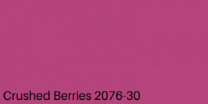
Another bold and fearless shade from Benjamin Moore for the ones who seek freedom in everything they do and enjoy it fearlessly. This Hot shade of pink has a lustrous finish to top your walls with the valiance you carry within you. The quirk and fun this shade carries with it can be the factor that calls you out of the bed every morning.
36. Banana Cream(SW 6673)
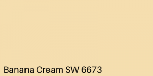
This shade of yellow from Sherwin Williams is for those who want to enjoy the brightness of yellow and the serenity of a neutral shade both at the same time. For the peeps who are both inventive and calm in their cooking patterns, this shade can suit all their moods giving them all the motivation they need for their cooking ventures.
37. Silhouette(AF-655)
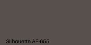
This extremely bold and lush shade from Benjamin Moore is one of my favorites when searching for exotically beautiful shades. With light tones of red, this shade of gray provides a sumptuous finish to your kitchen interiors when put on the walls. If want to do more with a lot less, then you can definitely go for this one.
38. Aplomb(AF-625)
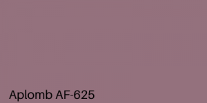
This pink hue from the Affinity Color Collection of Benjamin Moore is yet another exclusive contribution to the extravagant collection of exotic neutral shades. This shade with hints of gray works effortlessly on the walls providing you a wholesome and satisfying look the moment you step into the kitchen along with an added sense of calm in your awesome surroundings.
39. Chamomile(397)
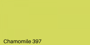
This exceptionally beautiful and bright shade from Benjamin Moore is the best combination of green blended seamlessly with hints of yellow if bright and lively shades are your ultimate callings. The quirk adds to your kitchen is unbelievable. Yellows have this unique ability to brighten and funk up the environment. Also, when mixed with greens to give a limey appearance, no one can their superior looks. Altogether, it’s a perfect blend of fun and fatal looks.
40. Moss Rose(SW 6291)
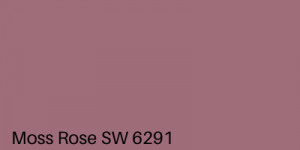
This neutral reddish-pink from Sherwin Williams tops my favorite list of reds available in the market. The unique appeal and elegance of this shade due to hints of pink add the much needed sumptuous finish to the kitchen interiors. I had never been pleased with red before I saw this in the aisle and I bet you’ll consider red too after trying this out.
41. Victorian Trim(2068-50)

This saturated shade of purple from Benjamin Moore is yet another shade that illuminates your space with elegance. Classic, soft and elegant at the same time, this shade is a complete package. Be a fun lover or a peace seeker, this makes every kind of cook feel at ease. So if confused about what to try, this might be perfect for you.
Colors are really important, be it our lives or walls. Adding the best colors is the prime motive of everyone in both these places. When comes to our walls, it can be a bit tricky and we might feel lost, but that’s alright, everyone has their first time. Even the most experienced ones can face difficulties and confusion for the same. But there’s nothing to worry about if you follow the right steps. You will see it all turning into a piece of cake in just a snap!