We may earn money or products from the companies mentioned in this post.
Is it just us? No, blue-GRAYs have been popping up everywhere lately and it has become one of the popular kids in the color game! Why? I think that psychologically, a lot of us are looking for calm and sophistication when we are talking about wall paints, and the romantic blue-gray combo, ticks all the boxes.
They are one of those colors that can bring our heart rate down. After the Covid 19 lockdown, we have certainly realized the importance of having good home interiors, and blue-gray is here to the rescue. This mixture looks more stylish and sophisticated than a typical blue shade and plain gray looks dull sometimes.
So, if you are like me and you are just finishing up a few projects around the house now, this post is for you! Let’s color-coordinate stuff and give them a new look. There are tons of choices when you are looking for a blue-gray shade and all of them serve different purposes. While they are mostly suitable for bedrooms, I have also dug up some which can fit in a statement wall or kitchen cabinet, and so on.
What is the blue-gray paint color? What does that really mean?
Did you know that all blues are created equal? Yes, that’s right! The blues are all same, but their undertones differ. Among several blue options, the popular ones include blues with green and purple undertones. Similarly, the combination here is blues with dusty gray or gray undertones.
They make some of the prettiest blues on the planet and I am not exaggerating. You would find many shades here- the one with more blue, the one with more gray and cool blue undertones, lighter ones, darker ones, and so on. You can bring home that sophisticated vibe with these striking and beautiful shades and I am sure you will love it!
Moreover, gray-based shades look different in different lights, giving the space a fresh effect every time the sun goes down and I think that is the best thing about the blue-grays. I have also mentioned a blue-gray shade with purple undertones, endless possibilities!
Check out 21 Best Blue Gray(Dusty Blue) Paint Colors now and sway with the trend right away!
21 Best Blue Gray(Dusty Blue) Paint Colors
1. Icy by Sherwin Williams

Icy with a code of SW6543 is a soothing light blue color with a dash of gray. As I have said, the blue-gray combination is best for bedrooms as these undertones would help you get the best night’s sleep. If you are looking for a sophisticated, light-colored blue shade, Icy would tick all the boxes here.
The grey combination here gives that stylish touch and you can avoid the typical baby blue look. Pair it up with white sheets and beddings with mildly warm lights and it would look amazing. You can establish this look in your kitchen and pair it up with white furniture. I am sure it would steal the show!
2. Santorini Blue by Benjamin Moore
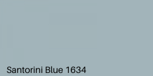
A color I have adored for years and recently brought that into my living room, Santorini Blue by Benjamin Moore is worth all the appreciation. Yes, you would definitely find similar shades of blue in those scenic houses of Santorini, Greece and you can get that vibe at home with this paint.
A blue shade with a gray undertone, you can make the gray dominate when there is no sunlight in the room. This one looks amazing when paired with crisp white wainscoting and I can’t take my eyes off from my living room right now. Try this out if you want that blue-gray hue to bring that cozy vibe to your interiors.
3. Upward by Sherwin Williams

A majestic blue shade from Sherin, Upward has got all your needs covered. Coming with a code of SW6239, this one is a subtle gray-blue color that can surely soothe your eyes. Perfect for the bedroom, you can also choose this one for the living area and laundry.
You would hardly notice the blue color here, but trust me, you will love this shade. Belonging to the same color strip from the brand, my next best choice would be Aleutian. You can use both the shades in one room and the outcome would be noticeable where you are just playing the undertones. Such an aesthetic touch to your adobe, right?
4. Thundercloud by Behr

Behr has got an amazing collection of blue shades, and I am not a big fan of their other color collection, the Thundercloud blue is one of my favorite. It is somewhat a combo of light and deep blue with a hint of gray. So, if you aren’t a fan of light or dark blue, this one is for you.
This exquisite color is soothing and is the perfect blend of gray and blue. The good news here is, you can paint any room in your apartment and it would look amazing. Pair it up with hardwood flooring, but avoid the wood stains for a stylish look. If you use gray furniture with this one, I am sure you would definitely earn some compliments.
5. Trend Alert! Naval

Yes, it has been awarded Sherwin William’s Color of the Year for 2020 and I cannot agree more. If you are looking for the true navy, Naval is right here for you with a color code SW6244. The perfect ratio of navy blue and gray is here to bless your living room this year and I cannot take my eyes off this one.
Pair it with brown stained or walnut color hardwood flooring, white furniture with blue cases, and add a white or light blue carpet for some extra flair. You can also choose this one for your bedroom if you are a fan of dark colors and combine them with mild lights for a stylish touch.
6. Storm Cloud by Sherin Williams

Another masterpiece from Sherin, the SW6249 Storm Cloud is just like the Navy color, but here you would notice the grey more than the navy blue. Add that dusty touch to your interiors with this unique paint and you are up for some compliments.
Besides the color, it has a superpower of adjusting with any lighting and I think you cannot compromise on that. This might not go well with walnut stained hardwood floors like the Navy one did, but if you can choose a lighter stain to make it work.
Fill your bedroom with the perfect amount of blue and gray with this soothing texture and beautiful finish. It is pretty sophisticated as well, so you if want a mild color for your office interiors, go for this one.
7. Eternity by Benjamin Moore

This ultra-soothing shade is here to style-up your nursery and study room and make you earn some compliments. Eternity by Benjamin Moore is a muted color shade that would definitely bring in that cozy vibe to your nursery. It is easy to grow into color, so you can put off painting for a few years as well.
Pair it up with coral and brown shades to get the best effect of perfect contrast together with sophistication. You can install gray furniture with this background and it would steal the show any day and I cannot get over this one.
8. Inchyra Blue By Farrow & Ball
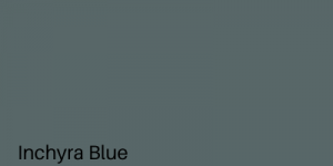
Inchyra Blue is a blue and gray combination where you can incorporate green color as well. This pairing is rare and if not done carefully, it can go horribly wrong. Big names in the industry have always suggested incorporating greens in your interiors to bring in some contrast and you must try it out.
From walls to standing shelves and cabinets, you can use this shade for anything and it won’t be a disappointment, I promise. It is a sort of serene color and can be paired up with light pink and white shades. Make this the background of your home bar and those glass bottles would add some mood with the help of this amazing paint.
9. Benjamin Moore Cheating Heart

Don’t feel cheated yet because this one is here to stay. With an amazing brand backup, the stunning blue-gray shade can be the center of attention in your living room with its amazing finish. Called Cheating Heart by Benjamin Moore, you must go over this if you want a hinge of cozy and dark shade in your interiors.
You can choose a wall or two for this one and combine it with lighter shades to maximize the effect. For a striking appearance, paint furniture with this hue and place it amidst a crisp white background. Even the most basic built-ins would transform into something magnificent, and all thanks to the color contrasting!
10. Sexiest Black Panther

If you do some research on the painting aspect of your interiors or you are attracted to home designing, you must know that when we are working with a textured wall, using dark paint would be the best choice. Don’t freak out by the name, it is a nearly black shade, but subtle blue touch would change the mood.
Also known as dark cyan, the striking gray undertones dominate the soft blue hue and it is just amazing. You can transform an ordinary wall with this one and combine it with lighter shades for the best results. Rest assured, the textured wall would be the crowned jewel of your house with this shade!
11. Waterloo by Sherwin Williams

You might confuse this one with Storm Cloud from Sherwin Williams, but this one has more blue undertones. It’s like another version of Storm Cloud with an extra blue hue and it is worth a try. Waterloo is an energetic and delightful color that would add some sass to your interiors and it has a striking appearance, right?
With a code of SW9141, Waterloo can be combined with some shades of coral and light blue-gray and almost every shade of white would go with this one. Again, this one could be an amazing stain for furniture. You can even paint your sofa set and combine it with a white backdrop to get stunning results.
12. Blue-gray with Purple Undertone

We did go through one with a green undertone, and here we have a blue-gray combo with a soothing purple undertone. This combination tends to look a bit cold and why not? Purple is a cool color and when you are adding up blue with that, oh good God!
This combo would give you that romantic vibe and it is associated with a traditional touch. So, if you are not looking for those coastal or party vibes, go for this one. One of the striking examples of this combo would be Jubliee by Sherwin Williams. With over 5 different shades, this one can coordinate with cyclamen and I am drooling over it for quite some time now.
13. Tinsmith by Sherwin Williams

Tinsmith is one of the softer and more muted blue-gray shades you will come across and I did say that we have everything for everyone, so here it goes. If you love light colors, choose this light-medium soft blue undertone with gray excess. Tinsmith is the perfect combination of subtle blue undertone dominated by light gray shade.
It can be combined with shades of white and other blue-gray combos and it is best to choose from one brand to customize it. An interesting fact about this hue is that the finishing and looks depend solely on the lighting. While you would hardly notice that blue color in daylight, warm yellow lights would make the blue hues dominate the walls and you would love that look!
14. Granite Peak- A Slate Color

For those who adore dark colors, this blue-gray shade has got those OG looks and it can transform a place to flat to fab in seconds. Granite Peak by Sherwin Williams can be a killer if you use it efficiently and I mean it in every way. With a less blue and more gray mix, this color can dominate a room without a doubt and you would love it.
You have got a textured wall? Paint that with Granite Peak. Do you have a statement wall complemented by light-colored walls? You got the clue! The options are never-ending and most of them are failsafe.
15. Light French Gray by Behr

Just like the name suggests, Light French Gray would be dominated by light gray with hints of white and supported by a light blue undertone. If you want that light blue to show up, pair it up with warm lights and you can experiment with it from time to time to maximize the effect.
Suitable for living, dining, and bedrooms, it is the lighter option of the popular French Gray which is again dominated by dusty gray color. The lighter version can be combined with dark color furniture and carpets. You can even choose a dark option from my list and stain a built-in to optimize the effect of Light French Gray!
16. Misty by Sherwin Williams

Misty belongs to the neutral family of Sherwin Williams and it is just one shade lighter than the well-known Samovar Silver. With a brand code of SW6232, this one has got that sophisticated vibe with it. It would feel more like the light blue with hints of dusty gray and it is so soothing!
You can choose this for a bedroom with proper lighting and it would be like magic. This would be my first choice for the kid’s room or laundry as I love to keep the vibe of those rooms light and calming. So, did you choose your favorite yet?
17. Online, the opposite of Misty

Yes, when we are exploring choices, I will not leave any stone unturned and here we are at another option which is just the complement of Misty. Online by Sherwin Williams is light gray with hints of dusty blue and though both of them would be indistinguishable in daylight, magic happens when you hit the warm lights and I am not kidding!
Online has a brand code of SW7072 and it has been chosen in the Pottery Barn Spring/Summer wall color collection for 2018. This would go well in the living or bedroom as you do need some calming yet energetic vibe in your house.
18. Silver Gray by Benjamin Moore

If you want to illuminate your interiors with some unique and extraordinary paint, Silver Gray is right here for you! From bedroom to your closet, this bold and saturated mixture of colors is worth a try. It has just the right amount of gray and blue undertones and I cannot take my eyes off this one yet.
Belonging to the Color Preview collection, Silver Gray has a brand code of 2131-60 and stands tall together with other exciting and striking combinations. It can be combined with some dark gray color options for the best results. You can always play with lights when it comes to blue-gray walls and this one could be your favorite in that part as well.
19. Benjamin Moore Boothbay Gray

From brass hardware to doors and walls, this paint can be your go-to thing for any need. Boothbay Gray leans closer to gray with the softness of blue and this makes it a wonderful choice for those who love sophisticated colors. It is pretty, a bit feminine, and has got those romantic vibes.
If you want a dusty blue combo, go for this one. There cannot be a better choice for doors and other accessories if you want to stain them. It is extremely popular in 2020 as the front door color and it would also look beautiful in kitchen cabinets and bathroom walls.
20. Smoke for those cabinets

We did explore many that could be the center of attention if you stain the built-ins and other major furniture with them. Next, we have a toned-down version that would be perfect for cabinets and doors as well. Smoke by Benjamin Moore would bring in a contemporary look to your kitchen and you will love it.
It can be paired with coral and rose hues and it looks stunning. Paint those cabinets with Smoke and make sure you have a white backdrop as well so that the subtle gray and blue mix make its effect.
21. Raccoon Fur by Benjamin Moore

Another from the Color Preview collection by Benjamin Moore, Raccoon Fur is a dark gray-blue combination that could steal the show any day! From statement walls to cabinets and closets, you can paint them up with this dark baby, and trust me, you will love it.
If you are painting a statement or textured wall, make sure you pair it up with light color furniture and make the perfect contrast. It can be paired up with Oak and Beige colors in your living or dining room. Just like Silver Gray, it is a striking color and it can transform a plain wall to a crowned king in seconds!
Blue-gray colors can never go out of fashion and I am sure you will agree with me now. However, choosing the right shade for your house is very important if you want an everlasting effect. Don’t worry about the results, assess your needs, and choose your favorite. Why wait? Go, paint them up!