We may earn money or products from the companies mentioned in this post.
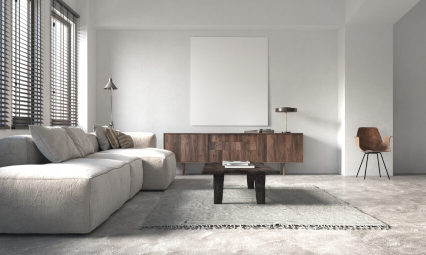
Gray is the One-size-fits-all shade in the world of paint colors. This is because it is ‘achromatic’, or lacking in color, as it is solely a mixture of black and white. The closer it gets to black, the more mysterious and elegant it becomes, and the closer it gets to silver or white, the more liveliness it radiates.
From a more psychological perspective, gray carries with it the ability to create a calm and stable environment without emitting energy.
This neutral property of gray makes it an excellent choice for interiors, whether you use it in combination with brighter hues to tone them down, or lighter hues to uplift them. In addition, it can fit ANY and EVERY kind of setting – You can use it for your bedroom, dining room, kitchen, or living room walls without worrying about it not matching the vibe because it will.
Gray has become a popular choice for the same reasons among homeowners and designers, be it a cool, warm, light, or bold version.
How To Choose a Gray Paint Color?
1. Focus on the undertones
Never buy a whole gallon of paint before checking the undertones first, as they might not really be visible on the chip, but pop out and surprise you after you are done with the walls.
2. Lighting
Apart from considering the undertones, keep in mind the kind of lighting your space has, be it natural or artificial. It just might happen that in excess of artificial lighting, gray walls appear green. Keep in mind:
- Excess of natural light will lead color to lean more towards blue and lighter
- In less to no natural light, of natural light, the color will lean towards warmer (green/yellow) and darker shades
- In a space with only artificial lighting (bathrooms, laundry rooms, etc.), the color will incline towards a significantly warmer shade with deeper color saturation. It will also appear a tad bit darker.
3. Match decor, flooring, and furniture
Again, the pre-existing interior finishings can bring out some hidden colors too. The director of color marketing at Sherwin Willaims, Sue Waddens, suggests that the interior must be coordinated with gray paint undertones to achieve a desirable effect. She says, “It’s important to consider whether the decor in the room is mostly warm or cool, and match the undertones accordingly”. She also advises being extra careful with using gray paint colors with green undertones in spaces like kitchens, as they usually have a number of wood elements that turn the green tones prominent.
Warm Grays vs Cool Grays
One common misconception about the gray color is that it is always associated with bleakness—because of this, most of us might shy away from painting our walls gray. But our homes wouldn’t look cold and bleak if we select the right gray out of the hundreds of gray shades out there, and that’s where warm and cool grays come in.
If gray has any of the following three undertones—blue, green, or purple, it’s considered a cool gray. Mostly, a cool gray is a mixture of white, black, and a bit of blue.
You can pair cool gray walls with brightly-colored furniture and decor pieces—they are known for making bright colors pop. They can also make small rooms look spacious.
If you want to make your room appear cozier, go for warm grays. A warm gray is a mixture of warm and cool tones and can have red, brown, or yellow undertones. There may also appear brown, beige, and taupe undertones, as compared to cool grays which have blue undertones.
Now let’s take a look at the 15 best gray paint colors by Sherwin Williams, one of the leading players in the game with great products, to ensure your satisfaction with whichever shade you go for.
15 Best Sherwin Williams Gray Paint Colors
1. Agreeable Gray

Agreeable Gray is a greige color which is usually called the perfect neutral paint out there and for a reason. This popular shade definitely lives up to its name because it complements both warm and cool tones in the space despite being more on the warmer side. No matter the interior, it WILL match well with the decor in your space, acting like glue and holding it all together to create an effective, balanced look.
It has undertones of taupe/brown. It has a few cool undertones, and hence in spaces with cooler lighting, it will appear cooler.
2. Useful Gray
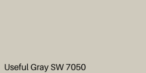
This one has yellow and green undertones and is quite similar to Agreeable Gray, but is completely a warm shade. It’ll give the room a more intimate look, so don’t hesitate to paint your bedroom walls with this shade.
And if you have natural wood flooring in any of your rooms, consider painting the walls with this gray as they both complement each other really well.
3. Repose Gray

Repose gray is more on the cooler side and looks great when matched with hardwood flooring, both light and dark. It has taupish undertones and is a mix of brown, greige, gray, and a teeny tiny amount of purple.
This gray will go along with any decor style, and that’s just one more reason to paint your walls with it.
4. Sea Salt

Sea Salt is a chameleon color—it will change colors dramatically with the change in lighting. In a space with no natural light, it will appear green with undertones of blue, whereas in a space with comparatively more natural light, it will look bluer.
It is recommended to use Sea Salt in a room with a considerable amount of natural light as its blue undertone will become more apparent and make the room look spacious.
5. Gray Screen

This true gray shade has blue undertones and appears cool. Among a bunch of light grays, this one would be the darkest. It’ll go along with dark and medium-toned brown floors, marble surfaces as well as other others that appear cool gray. This shade will suit both exterior and interior spaces.
6. Anew Gray

Anew Gray is one shade darker than Agreeable Gray and is a warmer greige and leans more towards gray. It doesn’t have a lot of undertones aside from a bit of green and purple, out of which green is more passive. Anew gray has a depth to it and is best suited for rooms that receive a generous amount of natural light and have high ceilings.
7. Amazing Gray

Amazing Gray is right between a warm gray and a cool gray, it isn’t as warm as beige or cool as gray. It also has a subtle hint of a green undertone. It would look good in contrast with white.
It is not advised to paint the whole house using this shade as it is too dark for that. Use this shade for rooms that have a lot of natural lighting as it would make dark rooms look more gloomy.
8. Requisite Gray

Requisite gray is a medium toned gray, a greige that has the perfect mix of warm and cool undertones. It has the right amount of brown to make it warm. It also has enough amounts of green and purple, without being too cool.
If you have purple or warm white furnishing and decoration, this shade is the right choice.
9. Wordly Gray

This genuine gray is less warm than Agreeable Gray, but the best quality it possesses is that it does not seem too cold. It’s warm enough to not radiate a concrete-like look and does not have any blue undertones.
It can be used in smaller spaces with not a lot of natural lighting like the bathroom or laundry room where Wordly Gray’s warm undertone will be more prominent. It is also a great choice for exteriors where it will look white with a bit of gray undertone.
10. Light French Gray

Light French Gray is a good shade for your interiors. It does not have any strong undertones, but a touch of blue can be visible in north-facing rooms. As compared to Agreeable Gray, Light French Gray is cooler.
Also, if you decide to paint the exteriors of your house using this shade, it will look brighter and lighter in the presence of sunlight and provide a fresh and crispy look.
11. Dorian Gray

Another greige shade by Sherwin Williams, Dorian Gray is a true gray that does not appear blue and has a few green undertones. It also has a fraction of purple undertones, that appear more than the green.
Dorian Gray will make your room look warmer if it’s south-facing, and if your room’s north-facing, you’ll find that its gray base will be more prominent (but some of the warmth will be retained).
12. Aloof Gray

This lighter, cool gray with a green tint is not greige at all and does not appear icy or stone-like. With the change in lighting, it can switch from a true pale gray to greenish. This neutral color looks beautiful when paired with white, black, true grays, and light to dark wood tones.
Aloof Gray can also serve as the backdrop for brighter colors, so there’s no way you can go wrong with this one.
13. Passive Gray

This one is a light blue-gray with a bit of green tint, without any purple undertones. Like Sea Salt, Passive is also a chameleon shade. In rooms with excessive bright natural light, it almost appears white with gray undertones. In early morning light and on rainy days, the color appears icier, as the blue undertone becomes more apparent.
14. Popular Gray

This warm greige paint color has a hint of pink and purple undertones. It isn’t a true gray shade, and can even appear taupe in certain settings.
15. On the Rocks

On The Rocks has muted undertones and appears very much like a true gray shade when compared to other grays.
This soft gray is more on the warmer side and appears light gray or even off white in certain lighting. This perfect shade is neither too warm nor too cold although it can appear much cooler in a north-facing room.
What to Avoid While Choosing Gray Paint
Now that we have enlightened you with some of the best gray paint colors by Sherwin Williams, it’s important we ensure you avoid some common mistakes when it comes to painting your walls with the shade of your choice. Here are things to keep in mind:
- Don’t pick grays with apparent pink undertones, as they won’t work well as neutrals and create an effect far from what you initially desired.
- Don’t overlook factors such as natural lighting when it comes to choosing gray for your walls.
- Most of the time, mixing cool grays with warm whites will not work. A warm white trim can make a room with cool blue gray look drab.
- When painting a room gray, make sure you factor in the other gray that’s already present in the room, for example, carpets, countertops, etc.
So many grays to choose from! And they all appear similar, with minute differences. That is why, we have at least solved that problem for you, by listing some of the best grays by Sherwin Williams and also pointing out how they’re all slightly different from each other. Keep the advice in mind, and get started!